

READ
One of my key projects at Ripcord was transforming the proprietary robotics scanning UI from being engineer-designed into being a more modern, user-friendly, and efficient touchscreen experience.
The redesign had to evolve gradually through modular feature improvements. We had to continually support not only our 30+ production staff in California but also our growing teams in Japan, ensuring perfect stability and seamless localization.
Over three years, we incrementally improved Scan App; enhancing efficiency, simplifying usability, phasing out clunky widgets, deleting old buggy code, solving new hardware requirements and addressing production staff needs. We enhanced it steadily from v.7.x to where I left it at v.11.x.
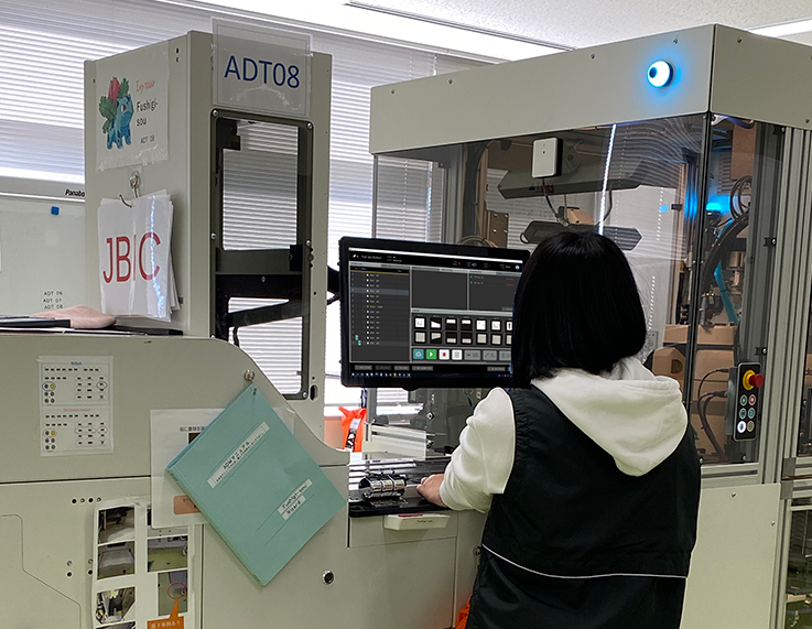
Additionally, we developed offshoots of the application that would run on the new bespoke scanning machinery, including the ADS, Manual Scan, Prep Station, and FDT. Now there’s approximately 100 production staff across 3 locations who use this UI daily to scan millions of pages in Hayward and in Japan.
The incredible challenge here was that this application was built in WPF (Windows Presentation Foundation); a clunky and difficult framework by Microsoft that screams old-school as you can see in the next column.
VIEW
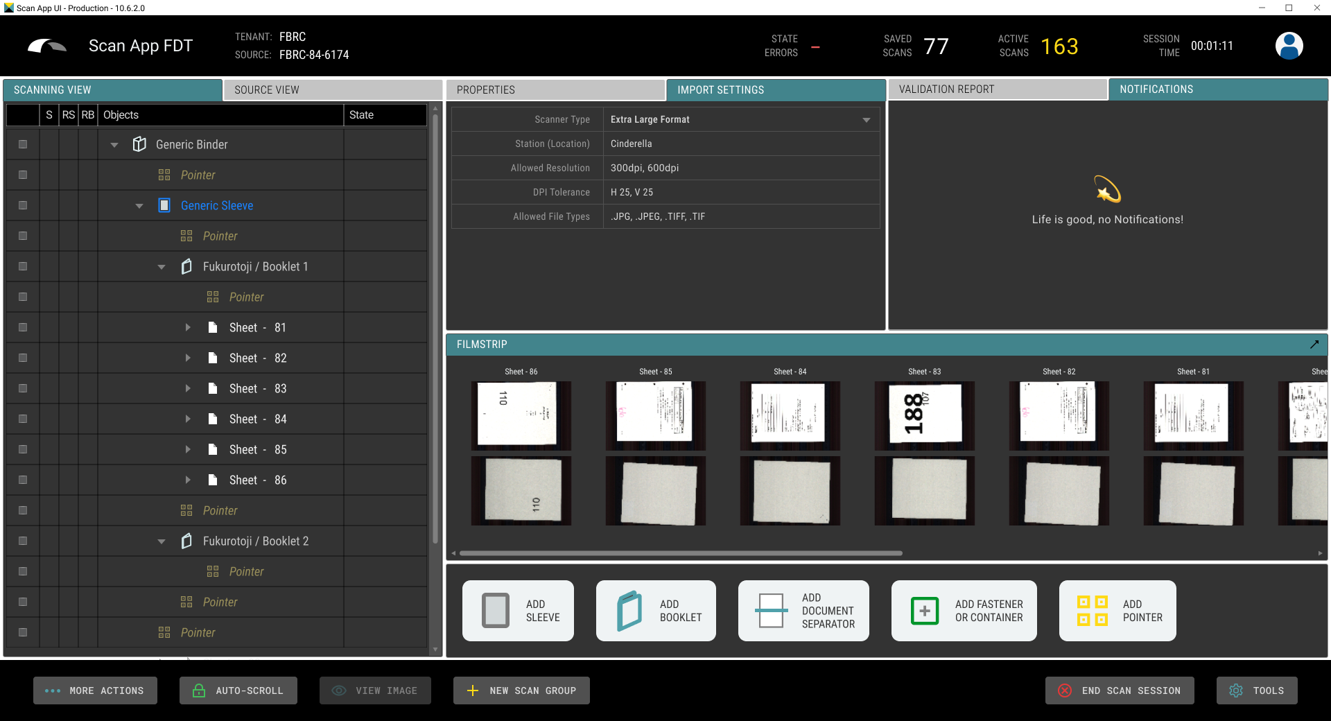
Example of the UI at v.10.6.2
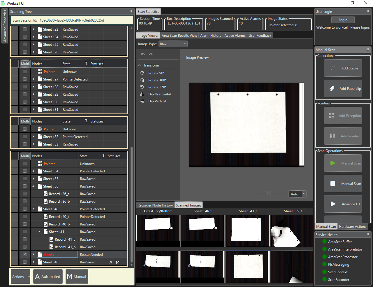
BEFORE; the UI when I first got the project
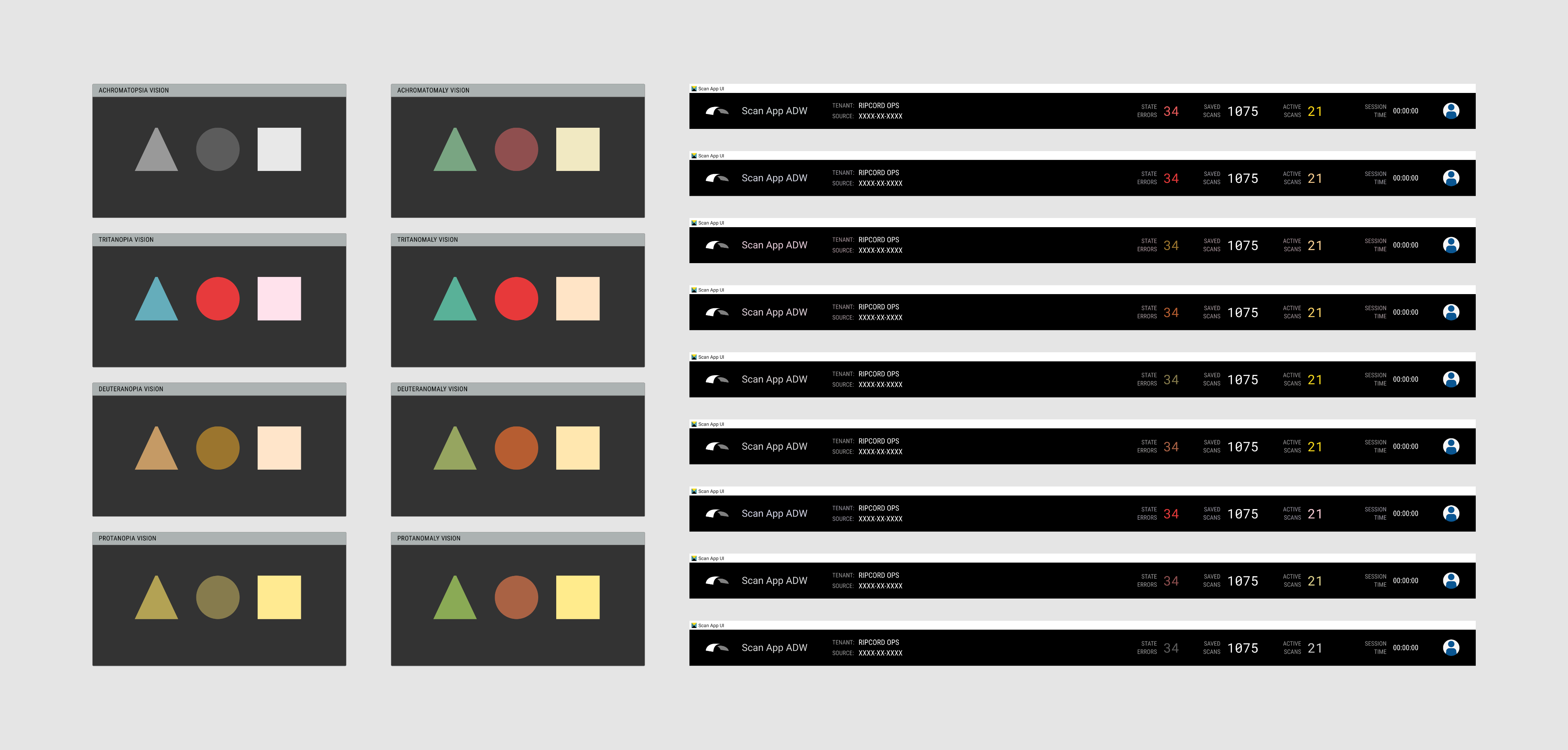
Component check for color blindness accessibility
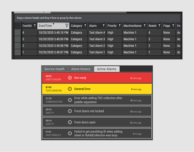
Example of before & after of the Active Alarms panel
DETAILS
My role:
Product DesignUI/UX DesignCopywritingIconographyPrototypingUsability TestingProject Management
Tools:
FigmaJiraConfluence
TEAM MEMBERS:
Jonathan Grubb, PMScott St. Clair, EMSteven Nguyen, Eng. DevJim Slutz, Eng. DevEric Engstrom, Eng. DevVinoth Sekar, QA Eng.Chris Fung, Production


READ
One of my key projects at Ripcord was transforming the proprietary robotics scanning UI from being engineer-designed into being a more modern, user-friendly, and efficient touchscreen experience.
The redesign had to evolve gradually through modular feature improvements. We had to continually support not only our 30+ production staff in California but also our growing teams in Japan, ensuring perfect stability and seamless localization.
Over three years, we incrementally improved Scan App; enhancing efficiency, simplifying usability, phasing out clunky widgets, deleting old buggy code, solving new hardware requirements and addressing production staff needs. We enhanced it steadily from v.7.x to where I left it at v.11.x.
Additionally, we developed offshoots of the application that would run on the new bespoke scanning machinery, including the ADS, Manual Scan, Prep Station, and FDT. Now there’s approximately 100 production staff across 3 locations who use this UI daily to scan millions of pages in Hayward and in Japan.
The incredible challenge here was that this application was built in WPF (Windows Presentation Foundation); a clunky and difficult framework by Microsoft that screams old-school as you can see in the next column.
VIEW
Example of the UI at v.10.6.2
BEFORE; the UI when I first got the project
Component check for color blindness accessibility
Example of before & after of the Active Alarms panel
DETAILS
My role:
Product DesignUI/UX DesignCopywritingIconographyPrototypingUsability TestingProject Management
Tools:
FigmaJiraConfluence
TEAM MEMBERS:
Jonathan Grubb, PMScott St. Clair, EMSteven Nguyen, Eng. DevJim Slutz, Eng. DevEric Engstrom, Eng. DevVinoth Sekar, QA Eng.Chris Fung, Production
